Reverse Engineering ChatGPT Web:
How OpenAI Built for a Billion Users

 Dennis BrotzkySeptember 3, 2026
It's hard to believe it's already been a year since Wealthsimple acquired Fey. I want to share what the past year has been like as a founder navigating an acquisition, what I've learned along the way, and what the three of us have accomplished so far. This post won't only be about performance, although there is plenty of that as well.
The three of us who built Fey have been working together for more than a decade, continuously obsessing over our craft. We often talk about how lucky we were to find each other. But I've always made a point of saying it wasn't luck, it was inevitable.
If you ask Tom or Thiago they'll tell you I have a saying: "Real recognize real." It's that feeling you get when you meet someone who just gets it. Someone who notices the details that only reveal themselves after years of obsession and pain. Someone who deeply cares about the things most people never notice.
People like that are incredibly rare. When you find them, you know. Real recognize real. That's been the secret to our friendship and founder success. We share that feeling.
It's safe to say the first few days were a culture shock. Going from a team of three to an organization of over a thousand, in one of the most regulated industries in the country, is a lot. Our onboarding was scheduled to take two weeks; we finished it in a day and got started shipping and designing. I remember Tom set up his machine early and even did the majority of onboarding before our first day.
The two places we cared about most were GitHub and Figma. All of Wealthsimple's client-facing code lives in a single monorepo: the mobile apps, the web app, and the internal tools. It's the largest repository in the company, with the most engineers working in it. Figma is a whole different beast that had what felt like hundreds of files.
At Fey, I had either written or could place every line of code. If there was a bug, I knew exactly which file to open and where to look. Here, it took me a second to get my bearings.
Luckily, even a year ago, AI was already incredible, so I leaned on it to learn the codebase. But we didn’t spend the first few weeks only learning the codebase—we were also putting up pull requests with new features and improvements. The decade of grinding, building our own startup, really instilled the need to ship and add value.
Even now, reflecting back on how we worked one year ago, it’s quite the difference compared to today. But more on that later.
First, though, let's look back at the start of Wealthsimple's web app when we joined. Here's roughly what it looked like:
Shell
  angular 1.8.2                   (EOL Jan 2022; owned routing, auth, the frame)
  @uirouter/angularjs             (the app's real router)
  react2angular                   (bridged every React surface into the shell)
  ng-redux · angular-translate · angular-moment · angular-local-storage

Web
  react 19.0.0 + react-dom        (mounted inside the shell)
  react-router-dom v5             (260 files importing it directly)
  graphql 16 + apollo client 3    (data layer)
  redux · thunk · observable · ng-redux (state, three generations deep)
  connected-react-router          (glued state to navigation)
  patchwork                       (design system)
  styled-components + 151 .scss files

Toolchain
  yarn 1.22 · nx 20 · typescript 5.8 · rspack
  eslint 8 + htmlhint
  jest 29 · storybook + chromatic (1,239 stories)
  playwright 1.36                 (61 e2e specs, all against live staging)

Codebase
  apps/web/retail/src             (659 files, 428 of them plain .js)
It turns out the web app was React running inside an Angular shell. Before the acquisition I had reverse engineered their web app and spotted Angular, but I couldn't tell how deep it went without seeing the codebase. The answer: Angular still owned routing, authentication, and the top-level frame of the entire app, and every React surface rendered inside it through a bridge called react2angular. You could feel it at the seams: for example, logging in happened inside the Angular shell, then on success a full page refresh handed control to the React homepage.
The state layer told a similar story: Redux with redux-thunk and redux-observable feeding the older surfaces, connected-react-router gluing state to navigation, and newer surfaces on newer patterns.
The component workflow was using Storybook with Chromatic visual regression tests, and the design language was built on top of an internal design system named Patchwork.
And there were significant performance opportunities once we dug into it. Initial loads were slow: company logos were fetched at runtime, one query at a time, while fonts were emitted with 10-year cache headers, meaning users could be stuck with font binaries from years earlier.
Session bootstrap made three sequential GraphQL round trips before feature flags initialized, adding roughly 5–8 seconds to a cold load. Navigation was also rebuilding the entire route subtree, and improperly configured suspense boundaries meant each transition could show a blank page while JavaScript downloaded.
There was no prefetching, and most Apollo requests used network-only, so users would see spinners even when the data was already in memory. None of these issues were that bad on their own, but putting them all together you could really feel it.
I knew if we wanted to transform Wealthsimple into the best place to invest and bank we needed to get the foundations right. It would be impossible to build a world-class experience in the current state of things. I took it upon myself to start working on the unglamorous fundamentals so everyone building on top of it could shine.
Two days after my SSH key was added, my first PR was merged: bringing Fey's security logos into Wealthsimple. At Fey we had spent an unreasonable amount of time collecting and cleaning up logos for thousands of securities, because a stock row with a crisp logo feels finished and a stock row with a blurry one, or worse a gray circle with two letters in it, feels broken. Three days later, the logic that picks the right logo for ETFs. A week in, Tom landed the first PR to the main app: a playtest of a global keyboard shortcuts system on the trading surface. He kept going from there. Within a month the shortcuts had a proper introduction flow, his floating dock for pending orders was live, and the dock was learning to navigate the entire app.
I love that this is how it started. If you asked me to name the least glamorous, most us thing we could have shipped first, it would be logos. Nobody puts logos on a roadmap. But you see them on every row of every table every day, and they're one of those details that quietly tells you whether the people building the app care.
Week one also taught us the most important fact about the codebase: an Nx monorepo with over a thousand packages where every merge to main deploys to production. No release trains, no queues. Merge it and it's live. Once you know that, the only bottleneck left is you.
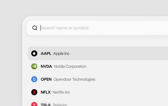
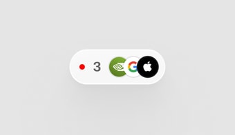
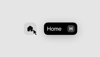
If I had to pick the single highest-leverage thing that happened all year, it's the proof of concept. Thiago had drawn a new art direction for Wealthsimple web, a set of first designs that looked nothing like the old web app. The obvious question was whether they could survive contact with the real thing: real data, real accounts, real orders. Tom took it upon himself to create a draft PR titled "Web art direction POC", on a branch called project/web-home, that implemented what web could be.
In a short five days it went from an empty package to a working app. The commit log went like this: initial on November 24, then font test, stock page speed test, order flow setup, order confirmation, search setup, search keyboard navigation, and navigation complete by November 29. By the time it was archived it had grown to over a hundred commits, ~300 files: a home page, stock page, account details with the wallet and direct deposit, a portfolio table, a full order flow with validation and tests, an options chain, a command palette, keyboard shortcuts, and its own icon set.
And to be clear, this was Tom's baby. He went hard: the first ten days of the log are him alone, 66 commits deep. I jumped in a week and a half later with 38 commits of my own. Tom still jokes I broke all his dropdowns. But I like to think I broke more than that.
My favourite part was a folder called Prefetch. PrefetchApp, PrefetchSecurity, PrefetchOrderFlow, PrefetchOptionsChain, PrefetchPortfolio. The POC made sure to have no loading states or skeletons. Pages painted immediately, nothing spun, and the new design language sat on components simple enough to read in one pass. We put it on internal test links and let people experience it for themselves!
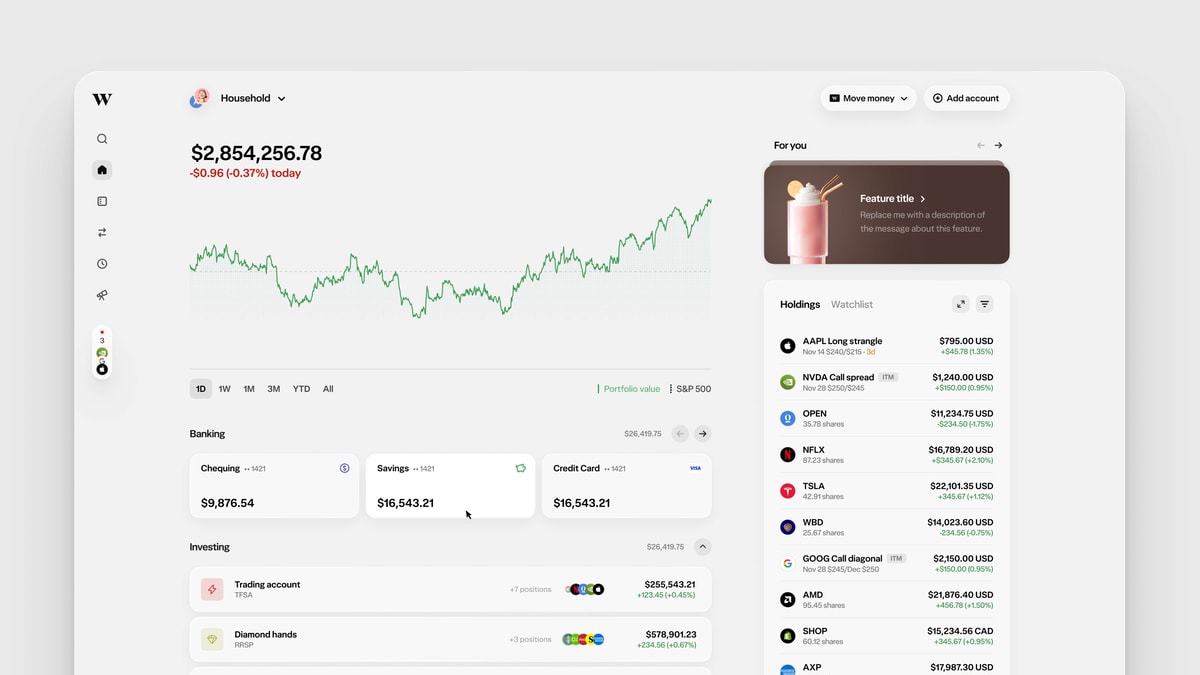
It was archived in January with a one-line note: "we're now rolling our learnings into the existing web project." Which is exactly what happened. The ws26 (Wealthsimple 2026) surfaces that shipped over the following months, the holdings dashboard, the new account details, all trace back to that branch. The POC became the standard we wanted to achieve in the production web app. It set the bar.
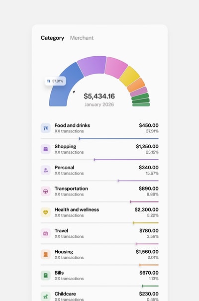
Then Thiago took the design language further. After the POC he built a gallery of components and interactions: holdings views, a trade-with-AI button, spend treemaps, privacy mode, currency switchers, nav drawer morphs, card animations, even shaders. And to be clear this was not a Figma file. He put together a site where he showcases the components and interactions he built.
A small aside: this is another example of how AI is changing the way we work. When we were building Fey, most of the designs Tom and I received were static, and we’d fill in the gaps as we built. Now, with AI, Thiago is creating experiences better than any engineer I’ve worked with. It’s genuinely remarkable to see what he can build. He is simply the best.
To give you a glimpse, I’ve pulled together a few of the pieces he’s built from his site into this post so you can experience them yourself. All of these have since made their way to production.
From September to December I went on a mission to improve the foundation of the web app. There was a lot to get through but I knew someone had to do the dirty work.
The Angular shell came out route by route. And to be clear, this was not a solo mission. A team at Wealthsimple had been chipping away at the Angular migration long before we arrived; the route decouplings, the UI-Router removal, the interceptor teardown all had names on them that weren't mine. What I think I added was fuel and determination. I went at it the boring way: decouple one route, verify it, move to the next. A single one of those decoupling PRs deleted 17,221 lines. The entire authentication layer (login, SAML, Okta, 2FA) was ported to React along the way. On December 3rd the final PR landed. I titled it "The final reckoning of Angular Deletening" and it removed the last 1,776 lines. The app was React all the way down.
While that was happening, Tom kept pushing the power-user features from week one. The shortcuts grew into a proper system, and the pending-orders dock learned to navigate the entire app. If you read my Linear piece you know how much I believe in the keyboard as a primary input. That system Tom built in the fall is still underneath everything today.
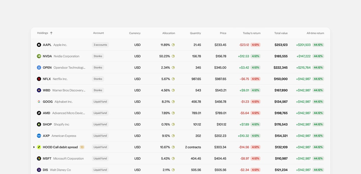
This is where Thiago's year lives, and it's the part you can see.
I want to be direct about something before the screenshots. I've worked next to Thiago for a decade and thought I knew exactly how good he was. This year I came to appreciate him even more. He didn't just redesign surfaces, he lifted the bar for what everyone at Wealthsimple expects a screen to look and feel like.
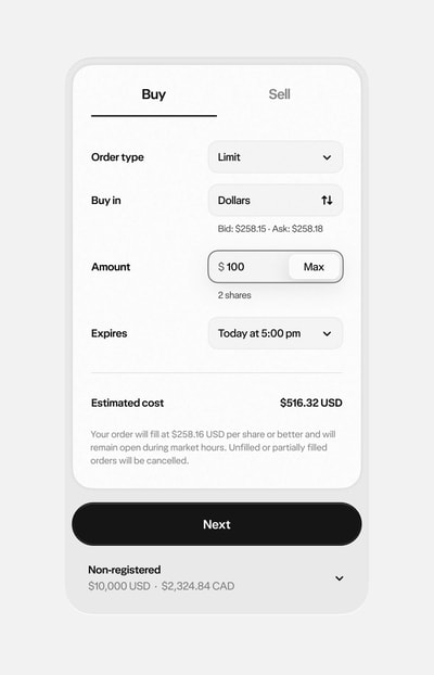
From January on, the app started taking a new direction. A full visual refresh: the navigation sidebar, order flows for five asset classes, a greenfield holdings dashboard. Then the chequing and credit card surfaces were rebuilt.
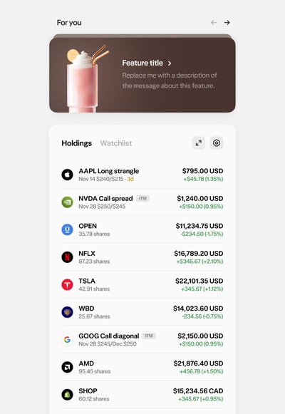
The holdings dashboard deserves its own beat. Tom built it, and it's the POC's clearest descendant: the dense table, the prefetch-everything loading, the keyboard shortcuts underneath. If you put the POC and the production dashboard side by side, you can see they're almost 1:1.
Holdings was a large pain point internally as we were having trouble making it fast and the stream of support tickets was getting exhausting. Very thankful Tom rebuilt it from scratch and turned it into one of the fastest pages on web.
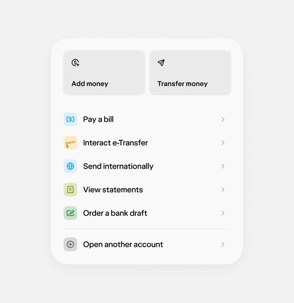
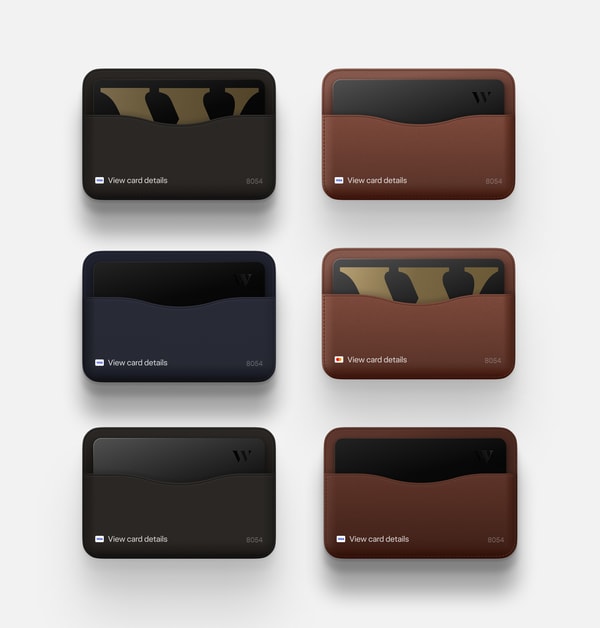
More recently, banking flows on web got improved. Chequing collapsed its maze of flows into a single card of actions: add, transfer, pay, done. And the credit card got a proper wallet, rendered in every colourway. Nobody needed the wallet to be this nice.
This was another great example of how AI is changing the way we work. I remember Tom working closely with the banking team to build out all of these features, and he was able to complete entire pages in what felt like a single day. Any feedback was addressed almost immediately, and he was often ahead of the design.
Before AI, pages like these would have taken weeks to build. Now, Thiago could build out the interactions, hand off the design, and Tom could turn it into a polished page within days. And this is just the beginning.
What I want you to take from this section is the pace. This wasn’t a two-year redesign with a big reveal. Surfaces shipped continuously, behind flags, as soon as they were ready. We weren’t just making the web faster. We were changing the speed at which Wealthsimple ships.
People always ask me how to make an app fast? Or how come the design looks so good? Or why it feels so good? My response is always the same: it's hundreds of little decisions done right. How you do anything is how you do everything.
Another belief I have (and, as a Psychology major, one of my favorites) is the broken windows theory. For those unfamiliar, it's the idea that visible signs of disorder create an environment where people are more likely to add to the disorder, or overlook it. It's why I believe details matter: as soon as you start slipping, it snowballs.
In code, I see this through URL design, API response bodies, schema design, waterfalls vs. parallel execution, caching strategies, pagination, error handling, retry logic, database queries, authentication, state management, component boundaries, prefetching, dependencies, logging, and validation. Every domain has its own set of tells, the clues that reveal everything to those who know where to look.
So while the big missions were running, I always kept a side quest going: cleaning up these details. Here is one of my recent favorites:
Every logo used to be fetched at runtime through a GraphQL query. So when someone loaded up their activity feed, we'd first make a request for their activity history and then each one would make another request to get the company logo for it. A painful waterfall.
Also, logos used to be PNGs served straight off a storage bucket URL. I rebuilt the pipeline around vectors and gave every security a URL you can guess. The logos are now sharp at any size, tiny over the wire, cacheable forever, and the URL is nice and simple.
// Before
ws-company-logo-cdn-bucket-prod.s3.amazonaws.com/logos_with_market/XNAS_AAPL.png

// After
logos.wealthsimple.com/aapl-xnas.svg
And of course I killed the waterfall request. Instead of multiple requests we now return the logo URL directly in the first request.
# Before: two round trips per row
query ActivityFeed {
  activityItems { id title symbol }
}
query SecurityLogo($symbol: String!) {
  securityLogo(symbol: $symbol) { url }
}

# After: the logo stitched into the item itself
query ActivityFeed {
  activityItems {
    id
    title
    securityLogo { url }   # an svg URL, rendered immediately
  }
}The app should paint its final layout immediately, from local knowledge, before any network response. So we cached the shape of the page, not just its data: the user's profile initial so the avatar doesn't flash icon-then-letter, account labels, even the skeleton row count so the loading state matches the user's actual number of holdings instead of a guess of 8. Charts reserve their loaded heights. Scrubbing values use tabular numerals so digits don't jitter.
The one-line font fix. Font files were emitted as [name].[ext] with 10-year cache headers, and a legacy ?v=N scheme meant the preload tag and the @font-face rule requested two different URLs, double-fetching every font. Content hashing the filename fixed both. One line.
Prefetching, everywhere, carefully. By the end of the year nearly every interactive surface prefetched what a click would need: routes on hover, data on hover, images on hover, chart data on segmented-control hover. We also created a system that ensured the cache key, which was based off the variables, was consistent.
// Hover: warm the cache
prefetchQuery(OrderTicket, { securityId, accountId });

// Click: the SAME operation with the SAME variables — instant
useQuery(OrderTicket, { variables: { securityId, accountId } });

// One extra variable on either side and the cache never hits.
// Auditing what the ticket actually reads on open is how the
// option-chain hover went from 13 requests to 5.The route layer. Remember the invisible remounting I mentioned? Every history.push on every page was tearing down and rebuilding the entire route subtree, because our lazy-route wrapper flipped between two JSX shapes while React.lazy resolved. React saw a different element type at the same position, which means unmount and remount. The fix keeps a single stable JSX shape and reads our prefetch cache directly. Prefetched routes now render synchronously on their very first render.
// Before: two different JSX shapes depending on whether
// React.lazy resolved. React sees a new element type at the
// same position on every navigation. Unmount, remount.
const Sync = getResolvedModule(loader)?.default ?? null;
const Lazy = useMemo(() => createLazy(loader), [loader]);

if (Sync) {
  return (
    <WidgetErrorBoundary Fallback={ErrorFallback}>
      <Sync />
    </WidgetErrorBoundary>
  );
}
return (
  <Suspense fallback={<Fallback />}>
    <WidgetErrorBoundary Fallback={ErrorFallback}>
      <Lazy />
    </WidgetErrorBoundary>
  </Suspense>
);

// After: one stable shape that reads our own resolved-module
// cache, suspending only for routes that genuinely aren't loaded.
// Prefetched routes render synchronously on their first render.
const PageLoader = ({ loader }) => {
  const resolved = getResolvedModule(loader);
  if (resolved) {
    const Page = resolved.default;
    return <Page />;
  }
  throw loadModule(loader); // Suspense catches the in-flight promise
};

return (
  <Suspense fallback={<Fallback />}>
    <WidgetErrorBoundary Fallback={ErrorFallback}>
      <PageLoader loader={loader} />
    </WidgetErrorBoundary>
  </Suspense>
);
Individually these are small. Together they're the difference between an app that works and an app that feels considered.
We knew we wouldn't be able to do everything ourselves. At a larger organization you have to think in systems. We have hundreds of engineers and designers.
In late December I took my first pass at updating our theme provider. This was a single massive pull request that updated our theme to use the new design tokens from Figma. It was the start of a new direction but we needed something that would go even further. The next step was to take the existing design system, Patchwork, and modernize it.
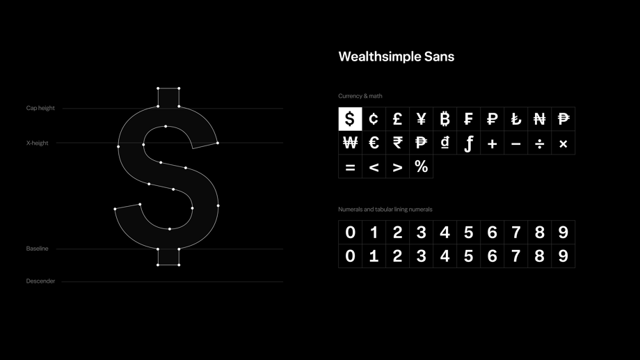
The goal I had was for our new design system to be based off Thiago's proofs of concept: the taste, the motion, the feel of every component, built exactly the way he believed they should feel. A lot of my work was turning those proofs into a system the entire organization can use. Guidelines, agent skills, Figma Code Connect, documentation, migration tooling. In other words, taking Thiago's taste and making it the default for the rest of the company.
Here's a peek into the new design system called Mint that incorporates Thiago's proofs of concept wherever possible:
Under the hood, Mint is deliberately modern and simple. It's built on Base UI, so accessibility, focus, and keyboard behaviour come from battle-tested primitives instead of hand-rolled code. It consolidates what used to be scattered across Patchwork, one-off components, and per-team forks into a single system, and it standardizes everything: tokens, motion, spacing, theming, one way to do each thing. It was built in parallel with the rest of the work in this article, without pausing a single migration or feature. And it's the first system we designed AI-first: fewer, simpler primitives with strong conventions and agent skills, so an agent or a new engineer produces the right interface by default. Beautiful by default, because the defaults carry the taste.
But Mint isn't entirely new! A lot of the fundamental layout and spacing was built on top of our old system, Patchwork. We took the lessons of the old system and folded them into the new one.
Mint went from a branch to the default across the company in weeks. Part of that is the tooling and the migration waves. This was another inflection point where I saw AI had taken another step. Before, a design system would take months and a team's effort, but now it can be built by a single person based off reference sources and taste.
In our first year, Tom and I merged more than a lot of pull requests into the monorepo between the two of us. The honest answer to "how" has two parts: a system built for shipping, and a year of going all in on AI. You can see over the course of a year our contributions kept getting higher and higher.
The AI itself changed under our feet. When we joined we were using Cursor, and plenty of code still got written by hand. Over the year we adopted Claude Code, and the models kept getting better. Somewhere along the way the job changed: we stopped writing most of the code and started managing agents. Today we run several at once and spend our time giving direction and feedback, because the mistakes have become rare enough that correcting them isn't the bottleneck anymore. Deciding what to build is.
You can see it in the numbers. From February 2026 on, a large share of our PRs were written pair-style with Claude Code, and that's exactly where both of our throughput curves inflect, roughly 4x month over month. The leverage compounds: the agent carries the mechanical middle (migration waves, test scaffolding, codemod stragglers, dead-code sweeps) while we stay on the parts that need judgment. Recently a support ticket came in about a feature that existed on mobile but not on web. I shipped web parity in about an hour, ticket to PR.
Mint is the clearest example of what this looks like at its best. A design system that would normally take a dedicated team months (tokens, primitives, docs, Figma sync, migration tooling) went from scaffold to GA in weeks, because agents built the mechanical surface area while humans made every design decision. AI didn't design Mint. It made building Mint cheap enough that designing it well was the whole job.
You still need to know what to ask for, and a high level of taste to know when an answer is wrong, or right but not good. The agent multiplies whatever judgment you bring to it. It's a tool with incredible leverage that rewards agency and taste.

A year ago the three of us were running a startup. Today we're inside one of Canada's most important financial companies, and here's what I didn't expect: the mission got bigger, not smaller.
Everything in this article, the deleted Angular shell, the redesigns, the design systems, the thousand small details, points at one goal. We want to build the best web and mobile app in the world. Not the best financial app. The best app. The bar is Linear, ChatGPT, the apps I write about on this site. Millions of Canadians manage their money through Wealthsimple, and they deserve software at that level.
The shape of the year is roughly this. The AngularJS shell came out route by route while the app kept shipping. Two design systems landed as compatibility seams, codemod waves, and lint fences, without stopping the line. Tom's POC became the blueprint, Thiago's designs became the bar, and surface by surface the app started looking like one product. Underneath it all, hundreds of small decisions: logos you never fetch, fonts that cache correctly, routes that render synchronously from a prefetch cache. And running through everything, agents that turned a cleaner codebase into compounding speed.
We're a year in and the foundation is starting to take shape.
On top of everything, AI is changing the game. We're at a stage where builders can build. Where people that have the vision can execute. I think year two is going to change the way we craft incredible software and I couldn't be more excited.
If any of this resonates, if you're the kind of person who notices the details most people never notice, come join Thiago, Tom, and me. Send me a DM on X. Real recognize real.